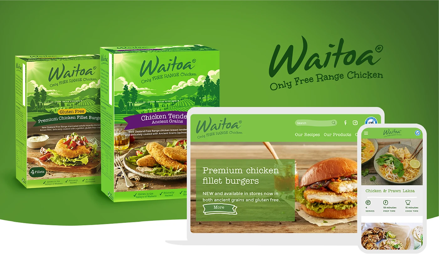
Brand refresh · Packaging
Waitoa
A fresh packaging and digital direction for Waitoa’s free-range chicken range.
Scroll to explore
- Project
- Waitoa
- Sector
- Free-range food
- Scope
- Brand refresh · Packaging · Digital design
A recognisable green packaging and digital refresh bringing clearer hierarchy and food-led imagery to Waitoa’s free-range range.
Project context
The refresh uses strong green brand recognition, clearer product hierarchy and more visible food photography across the range.
Packaging and responsive digital applications are developed as one consistent consumer-facing system.
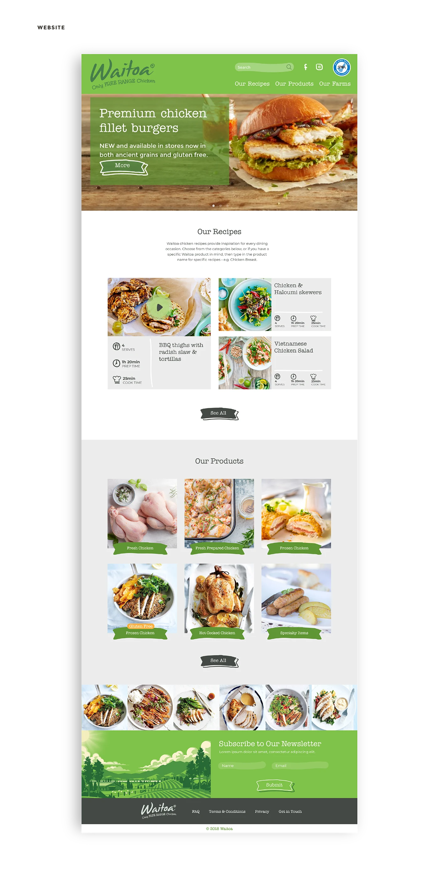
Fresh from the range
The standalone project-description slide is rebuilt as responsive content while packaging, food and the full site remain visual.
Recognition, clarity and appetite.
Recognisable
Strong green protects the familiarity of the established brand.
Clear
Improved hierarchy makes product variants easier to navigate.
Appetising
Food photography creates a closer connection between pack and plate.
