Brand identity · Digital
Tahi
A minimal technology identity built around unity, precision and the upward movement of growing businesses.
Scroll to explore
- Project
- Tahi
- Sector
- Technology services
- Location
- New Zealand
- Scope
- Brand strategy · Visual identity · Digital design
A precise technology identity that turns unity, mathematical balance and upward movement into one minimal system.
Project context
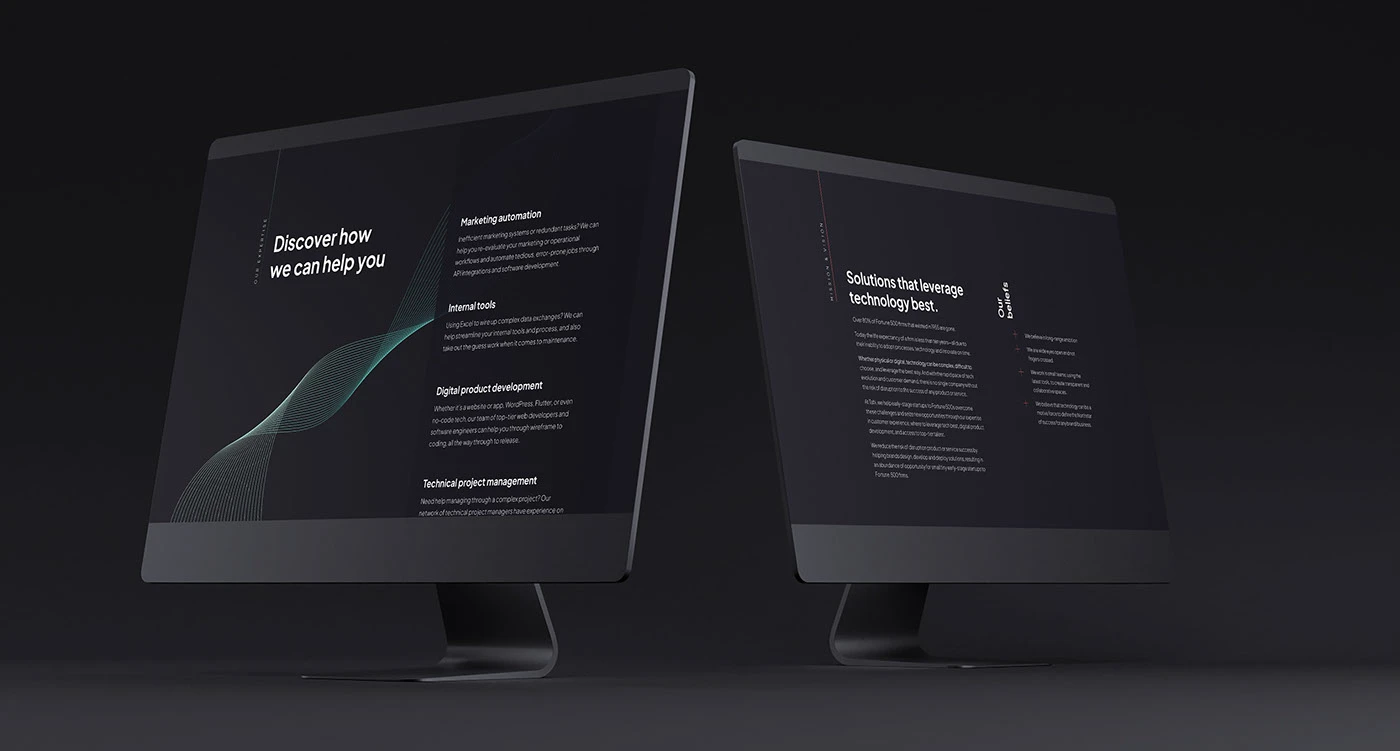
Tahi offers website and process technology for startups and growing companies. Its identity keeps communication simple and direct.
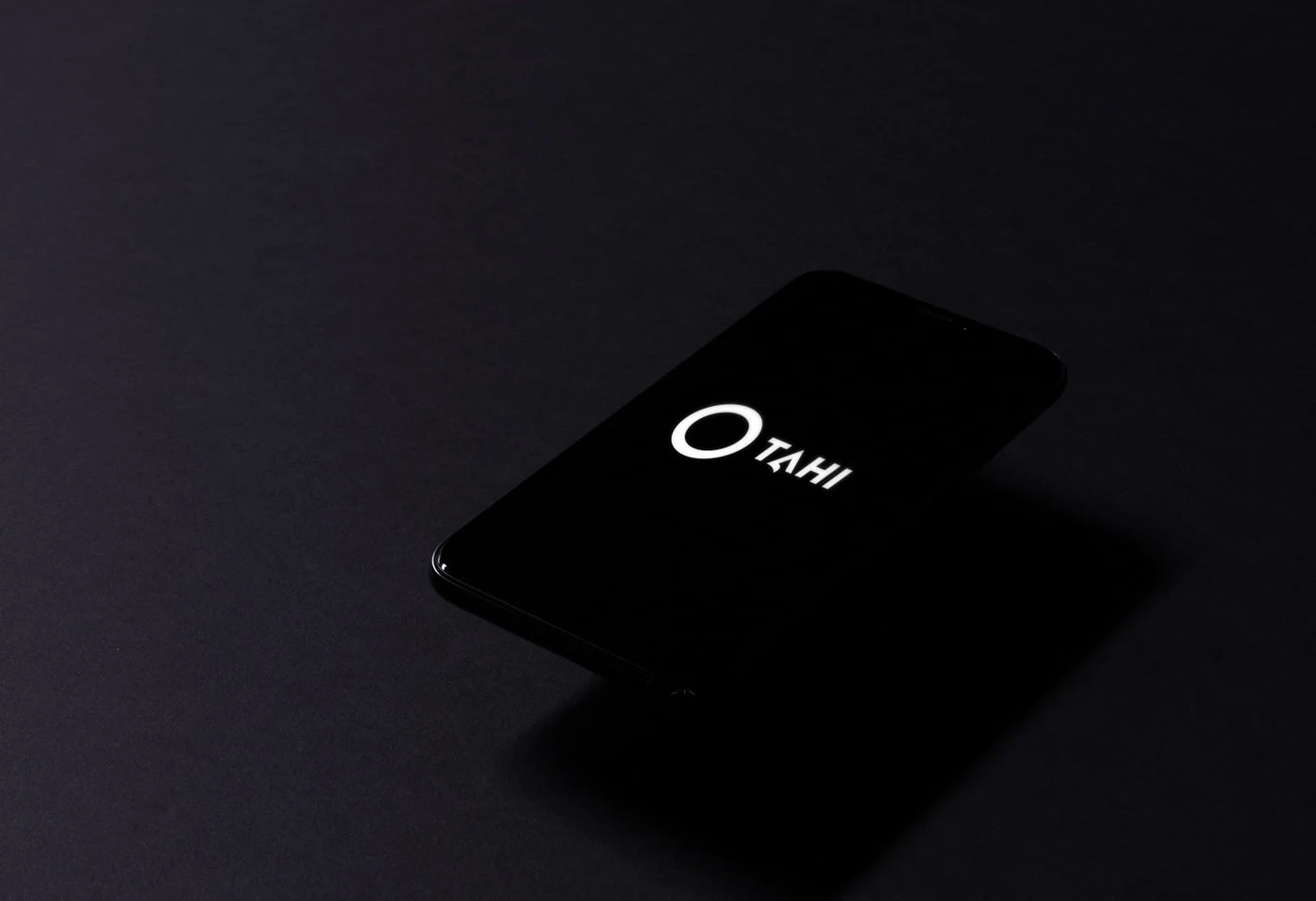
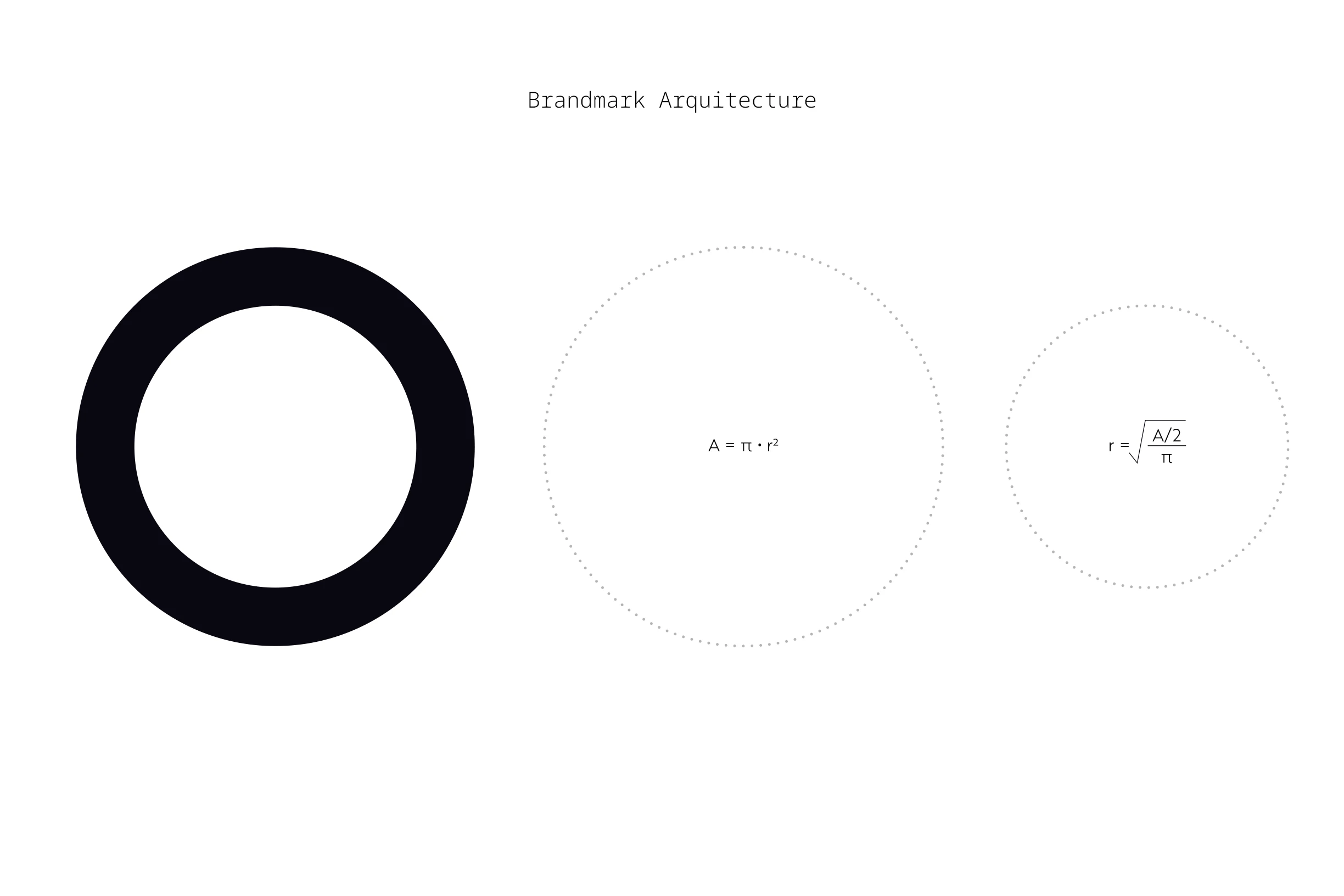
The name means unity or oneness in Māori. A mathematically balanced circular mark and an upward-pointing A connect that meaning with accuracy, growth and New Zealand’s visual landscape.

Built as one
The presentation slogans and typography slides are expressed here as responsive content around Tahi’s central idea of unity.
Together, as one. In unison.
Unity
The Māori name anchors the identity in oneness and connection.
Precision
A mathematically balanced circle gives the mark clarity and control.
Growth
The upward-pointing A reflects progress for startups and growing companies.