Brand identity · Digital
More Loans
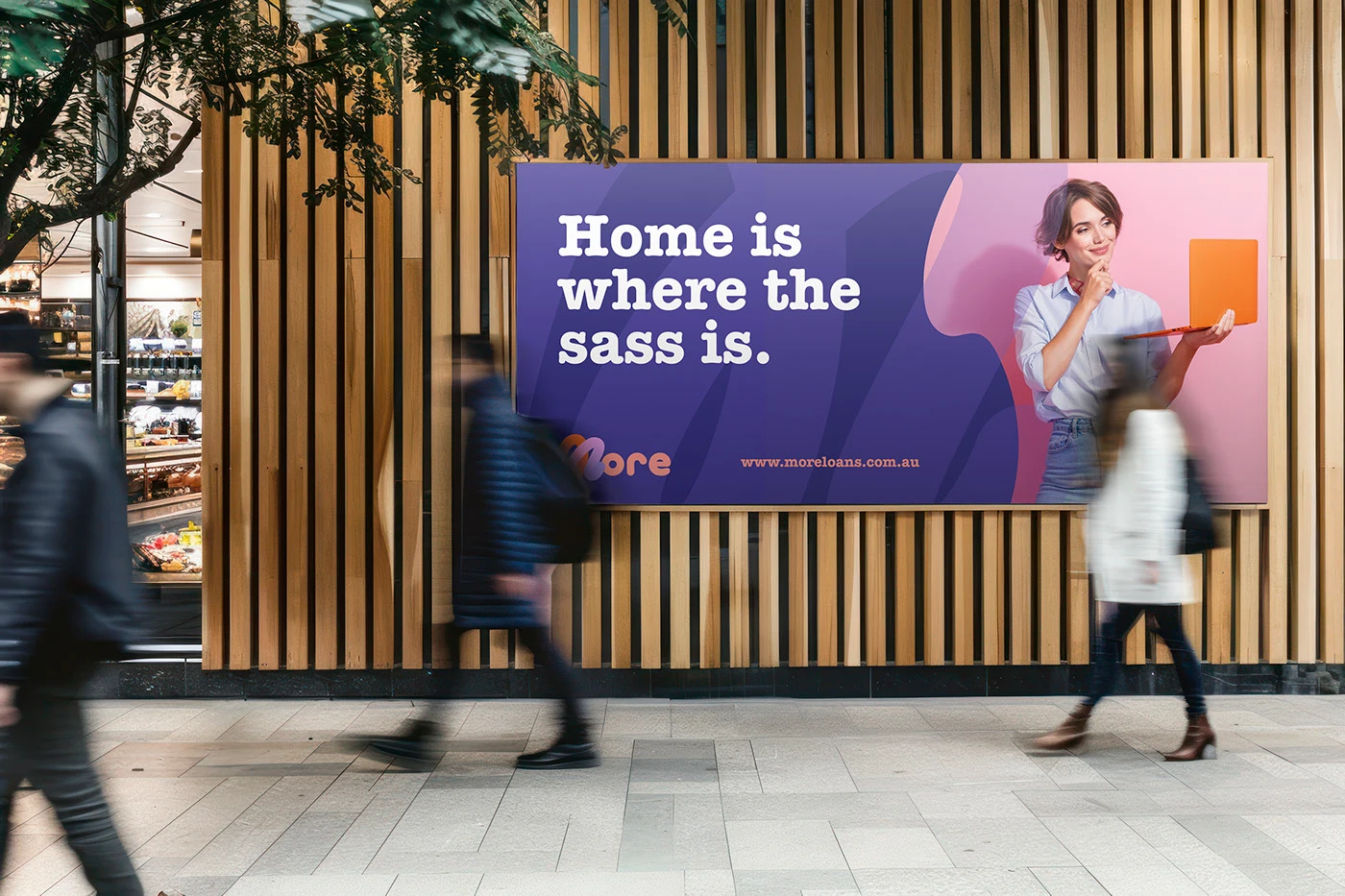
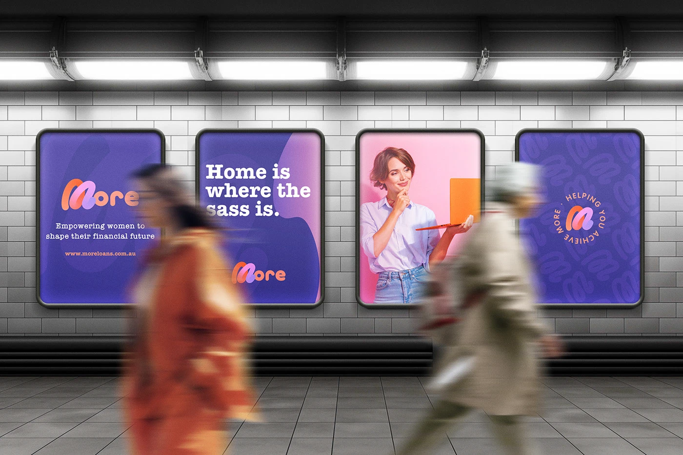
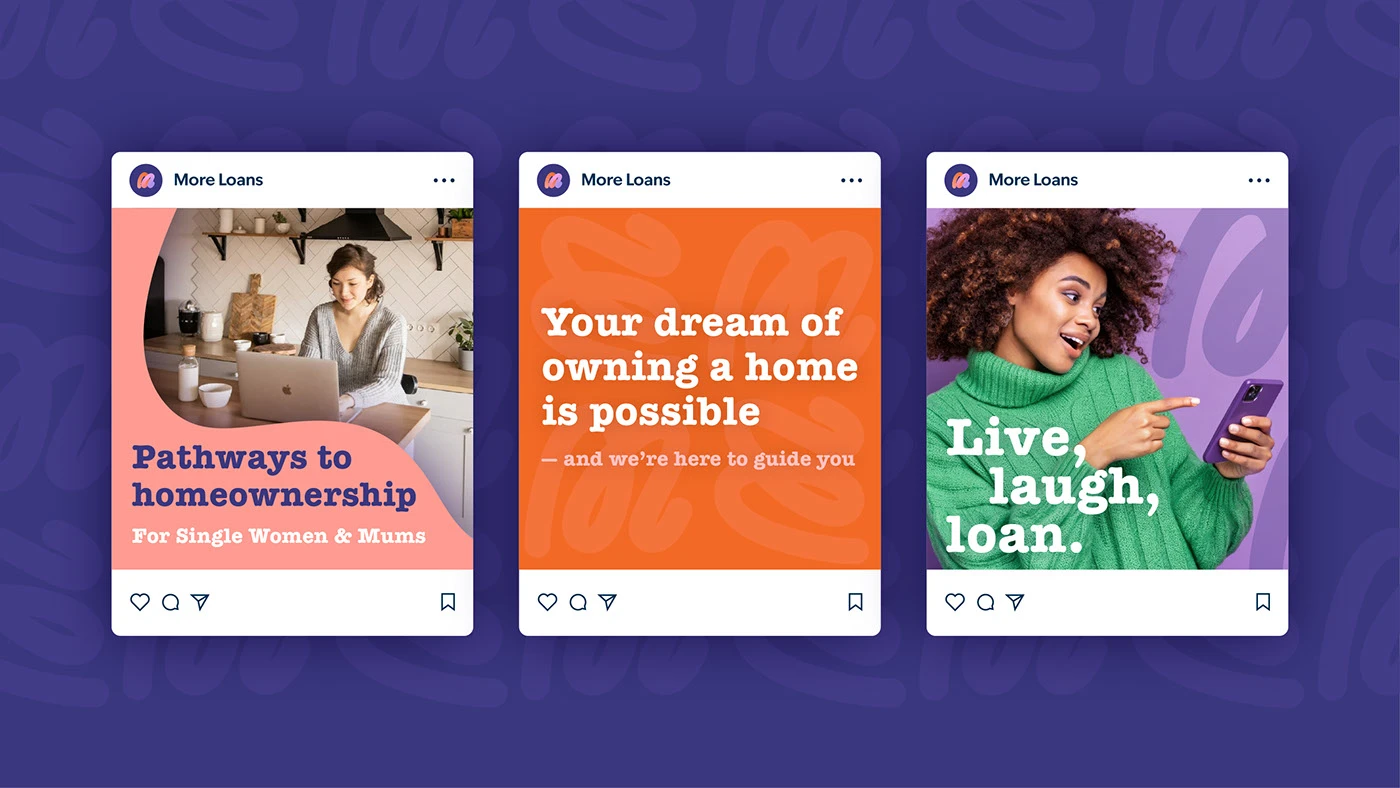
An approachable, trustworthy and confident identity for a mortgage brokerage helping women move towards home ownership.
Scroll to explore
- Project
- More Loans
- Sector
- Mortgage brokerage
- Scope
- Brand strategy · Visual identity · Motion
A mortgage identity designed to replace financial intimidation with warmth, clarity and confidence.
Project context
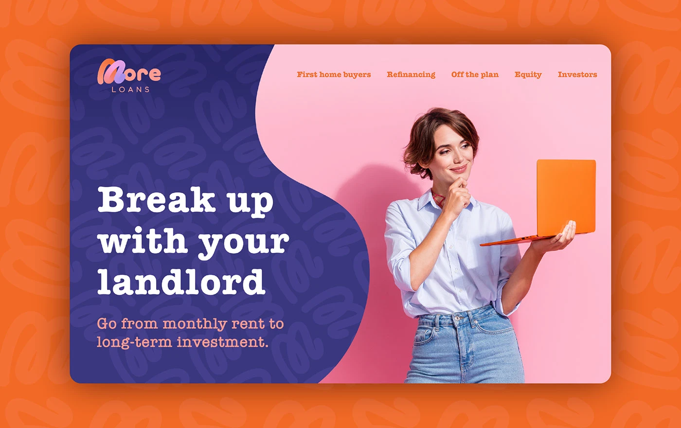
The identity was shaped around the needs of single women and mums taking a bold step towards independence and stability.
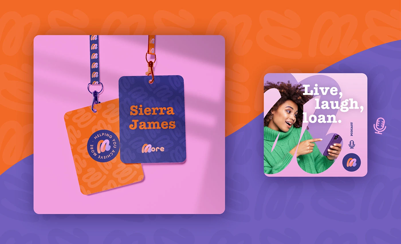
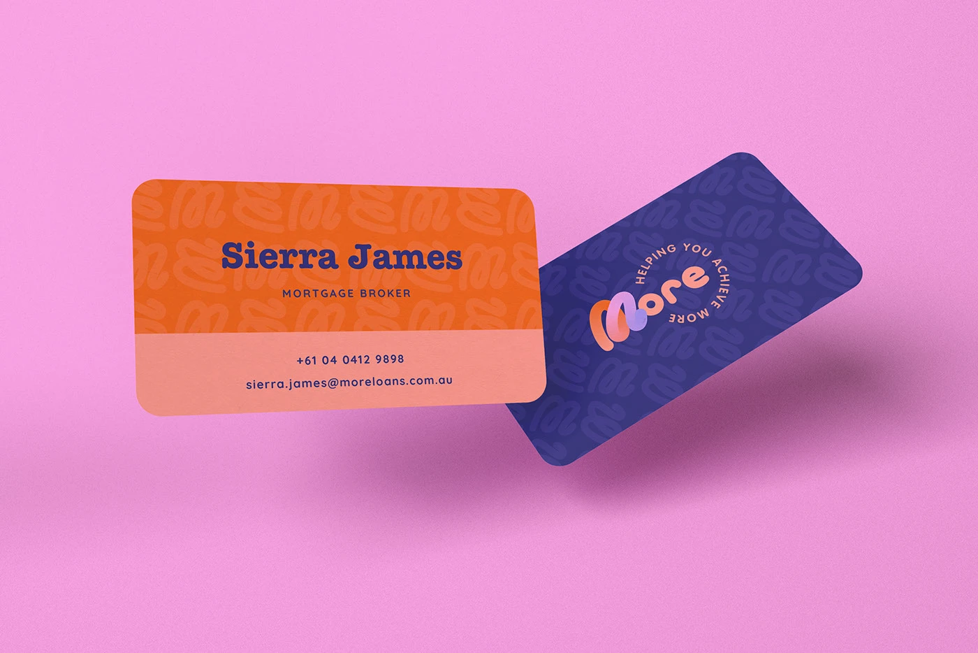
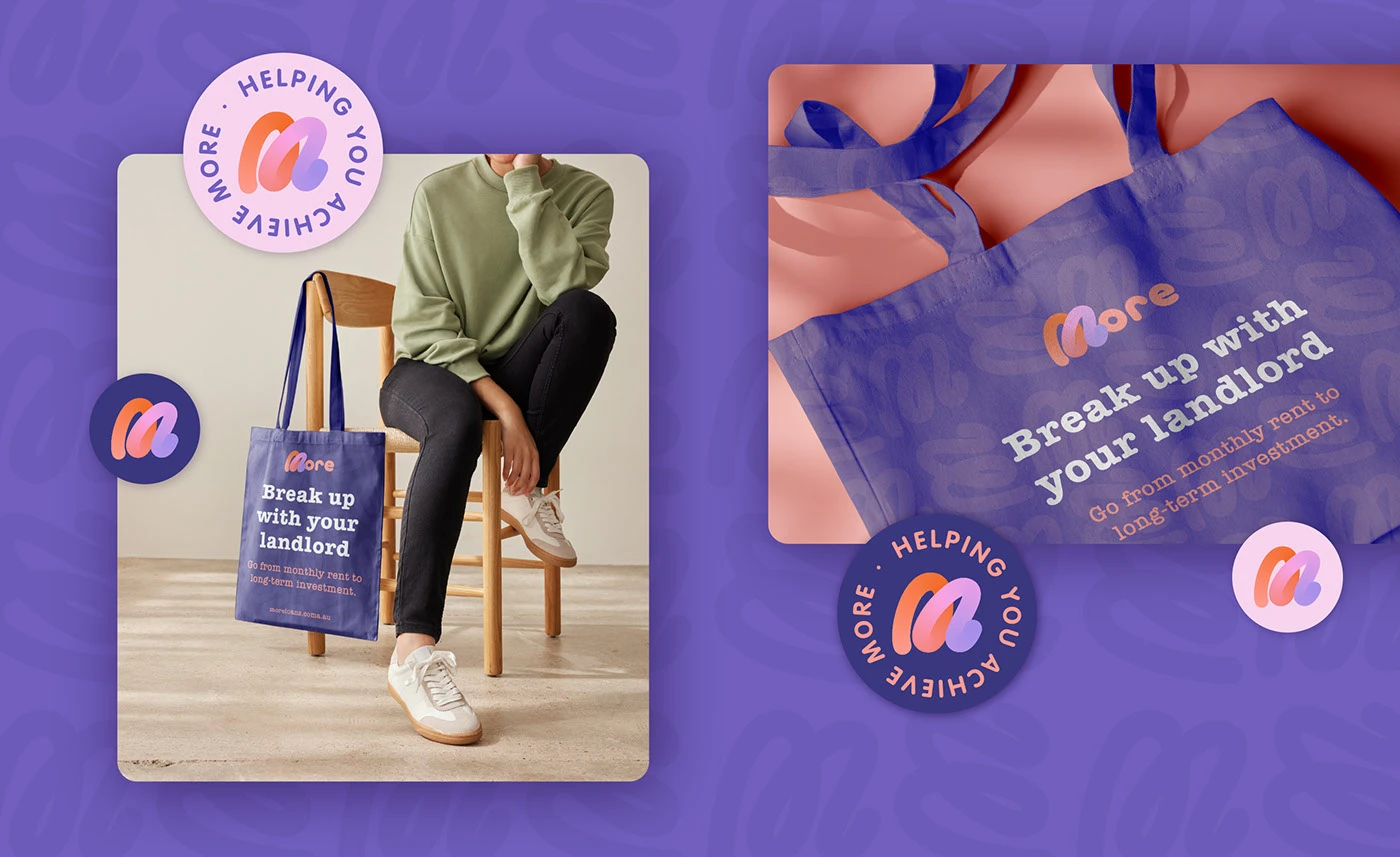
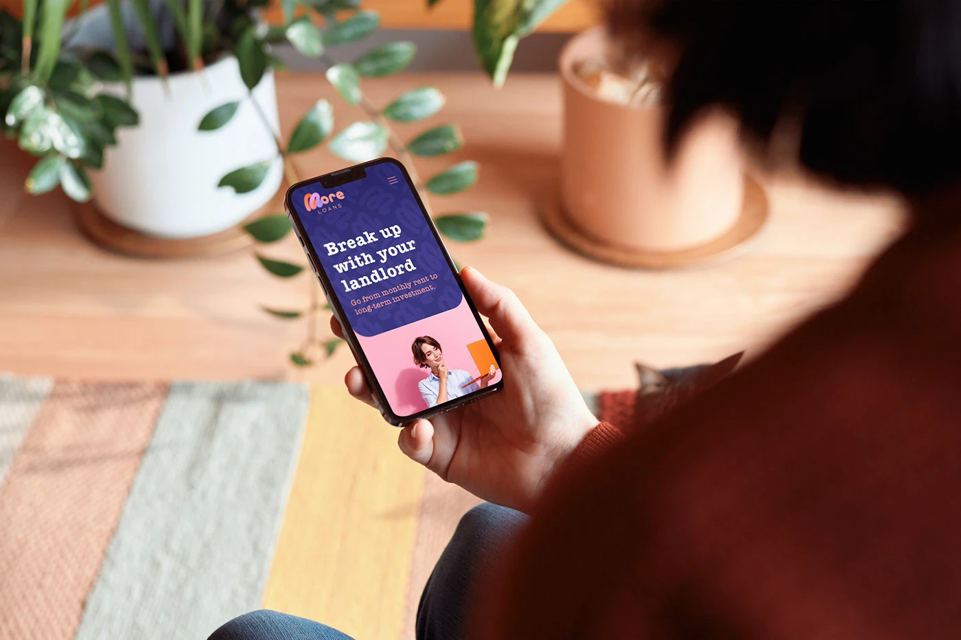
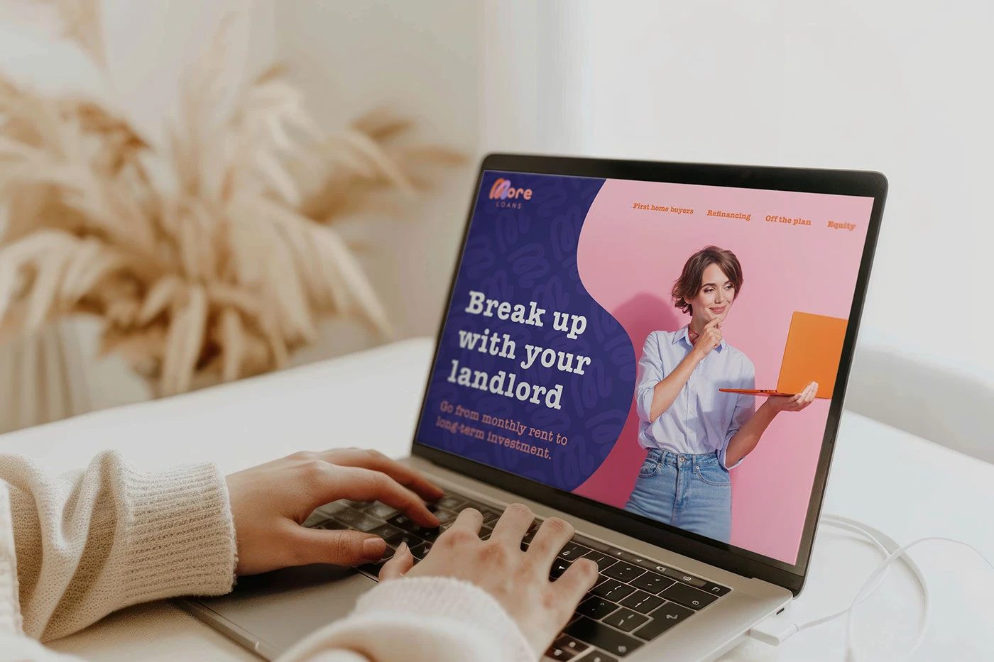
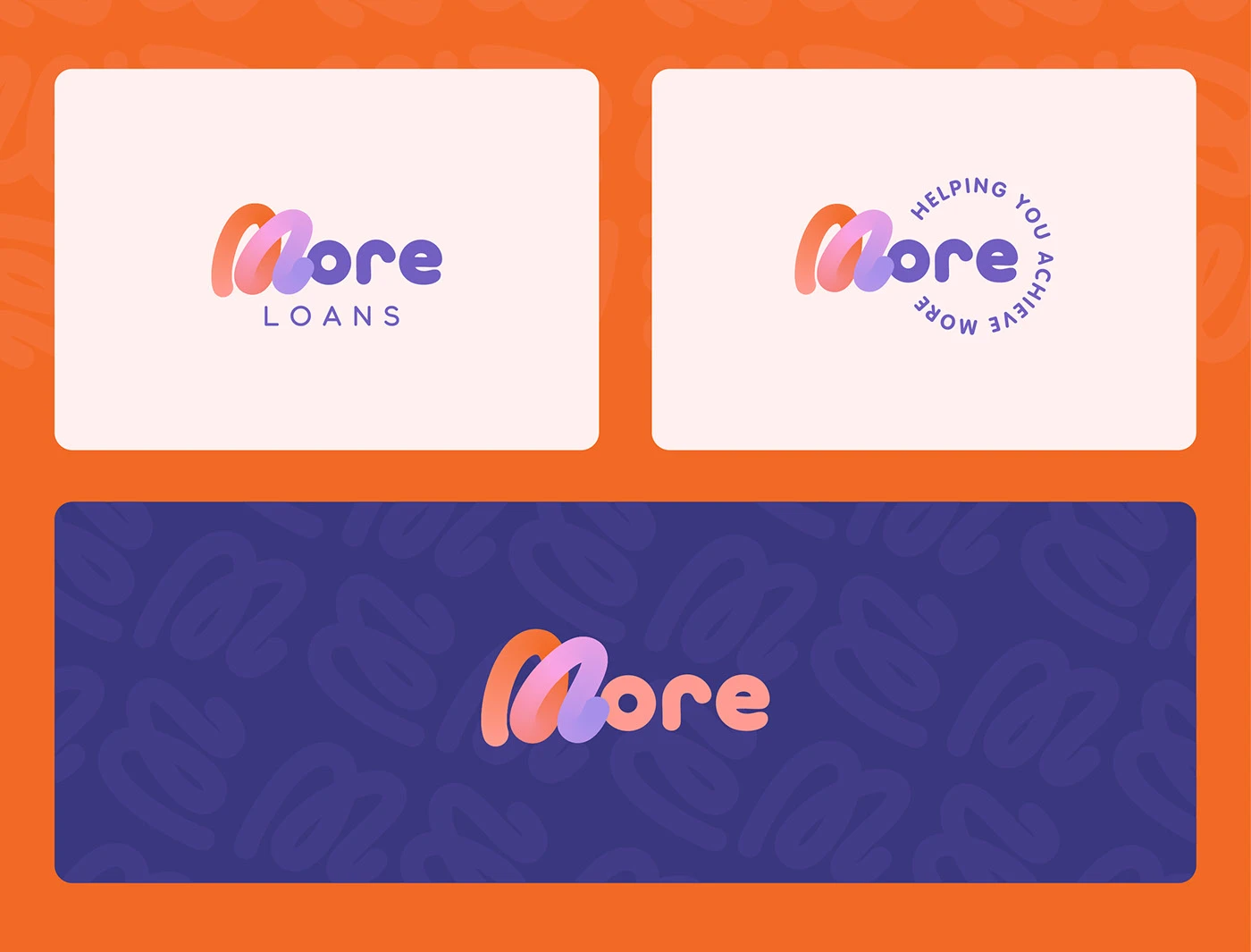
A hand-crafted logo, warm colour system and direct digital language balance support with strength, making a complex financial category feel clearer and more human.

The brand system
Identity principles translated from the original presentation into accessible, responsive page content.
Supportive enough to feel human. Strong enough to inspire action.
Warmth
A softer palette makes finance feel more approachable.
Clarity
Direct messages cut through mortgage complexity.
Confidence
Bold type and decisive contrast support independent action.