
Brand identity · Digital
Investor Kit
A clean, accessible identity for a property-investment service and its digital communications.
Scroll to explore
- Project
- Investor Kit
- Sector
- Property investment
- Scope
- Brand identity · Digital assets · Art direction
A direct property-investment identity designed to make research, guidance and financial progress feel more accessible.
Project context
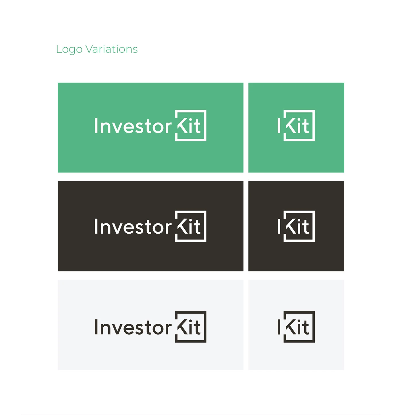
The identity uses a compact wordmark and a fresh green accent to make the category feel direct and approachable.
Presentation and digital applications build a consistent, practical system around the core mark.
Accessible investment
About, construction, palette and typography boards are condensed into responsive identity principles.
Property guidance, made approachable.
Direct
A compact wordmark communicates the offer without decoration.
Fresh
Green creates a more approachable alternative to traditional finance palettes.
Practical
A controlled system works cleanly across presentation and digital material.